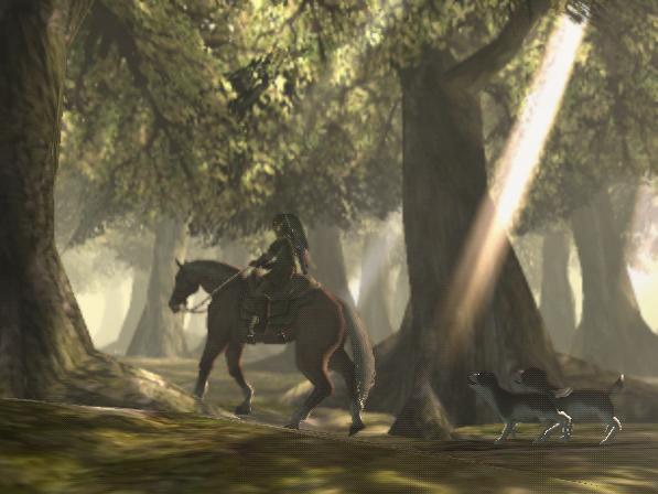
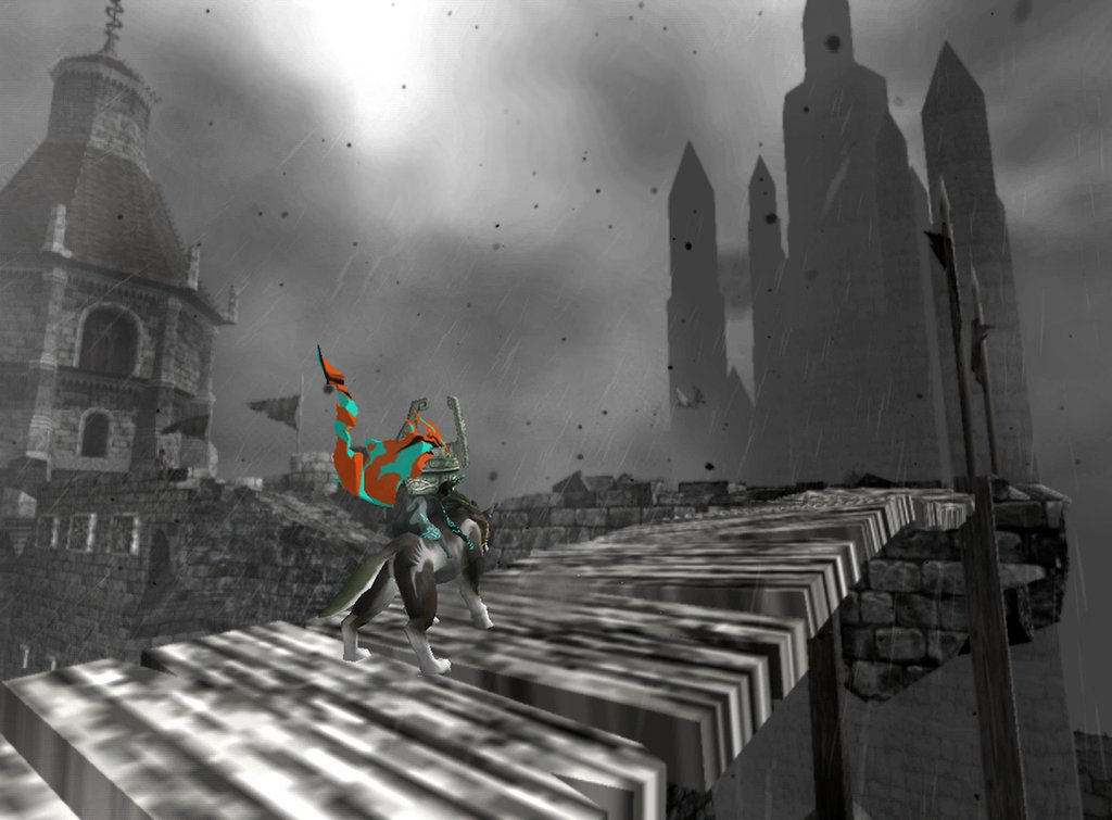
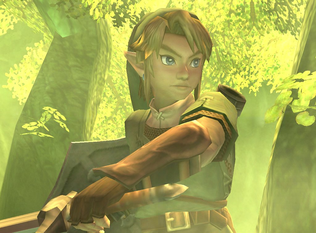
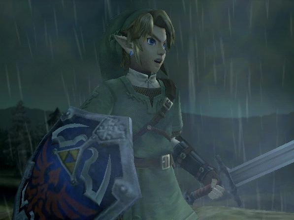
The lesson on creating a desaturated palette drew my thoughts back to my some of my favourite video games The 'Legend of Zelda' series. The wii title Twilight Princess has been haled as one of the more 'darker' games in the series. I suppose I agree with this but the visuals coincide with he content and had me thinking how they influence the way the player feels. The colour palette as demonstrated by these images I have gathered shows the palette is made up of harmonious colours and a range gained by using broken versions of them together. It gives the mood of the story a more mature feel. Overall the colour communicates with the player what kind of game they are playing if they were to look at a screengrab of twilight princess then they would understand instantly merely from the colour palette that it has a darker and serious theme to it. Another example proving how important colour is in story telling.


Now compare twilight princess colours to the newer addition to the legend of zelda family skyward sword... My mood has lifted already just from looking from the twilight screen grabs to this one. There are still some broken colours but they compliment the areas of highly saturated bright areas like the flowers and the red blob.

The creators claimed to have referenced the work of the french painter Paul Cezzane.

No comments:
Post a Comment